To see the full website go to winerylane.com.au

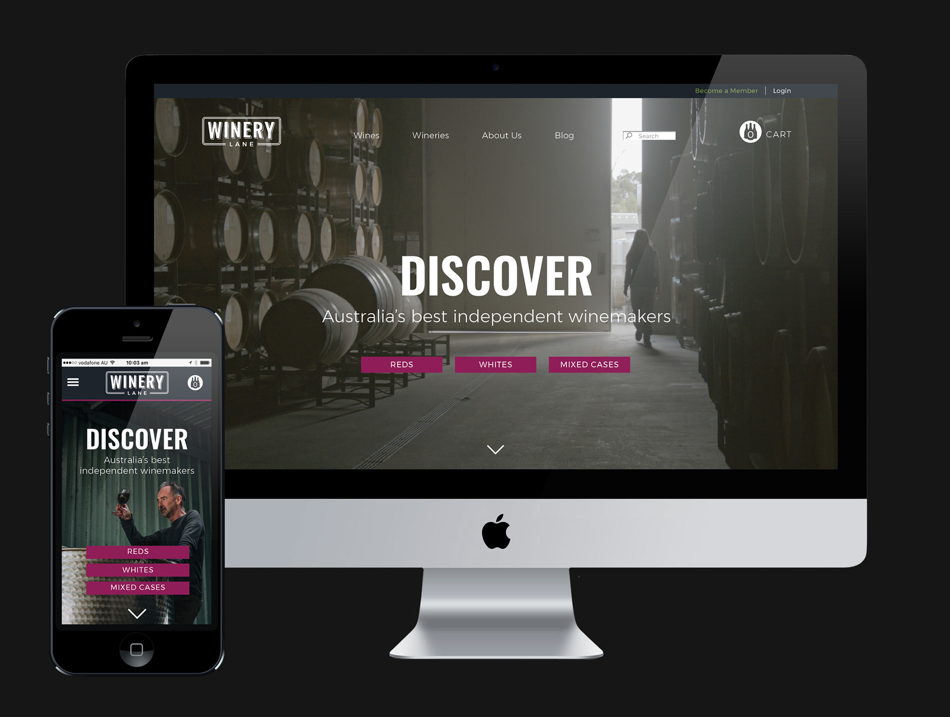
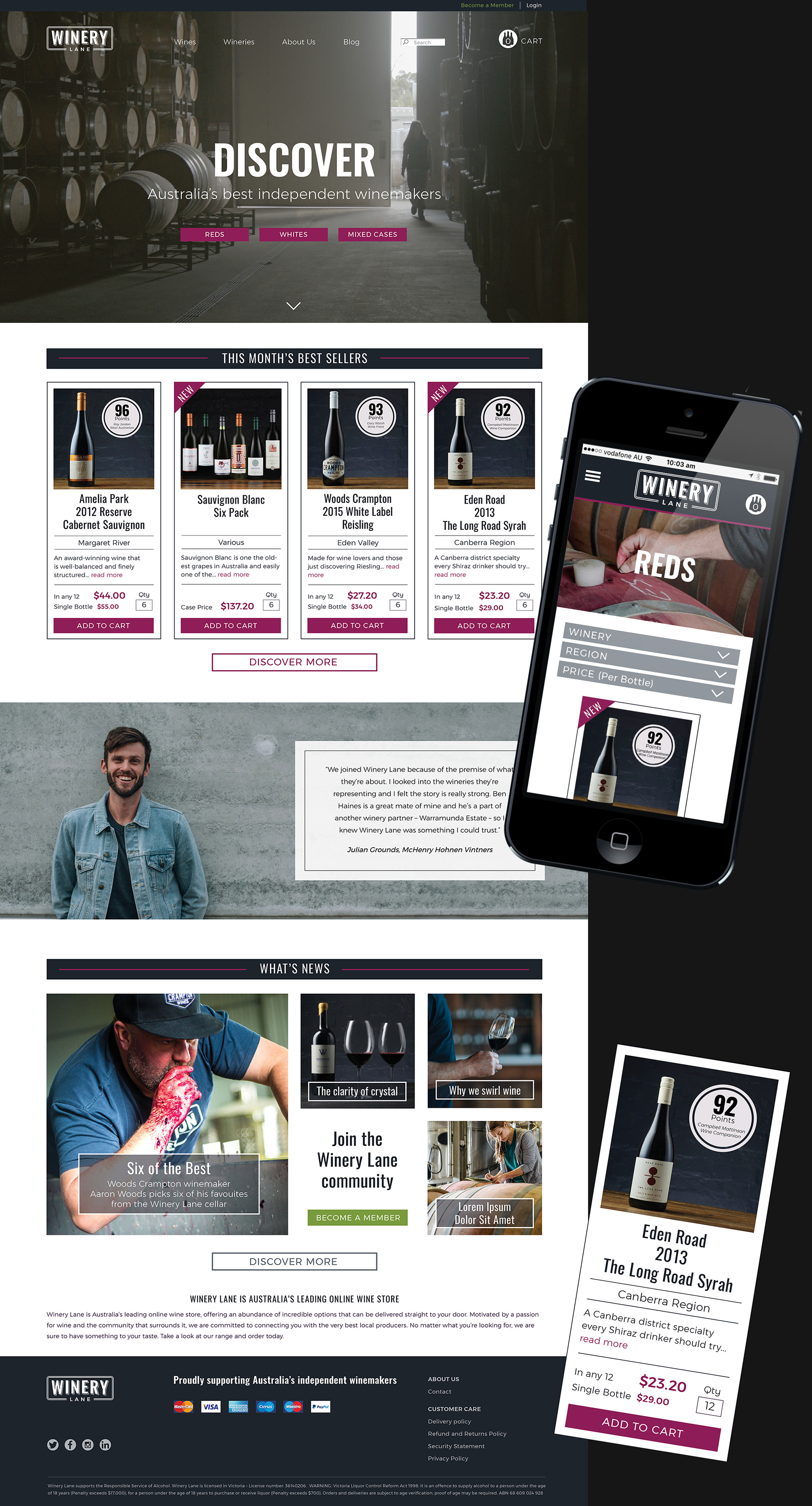
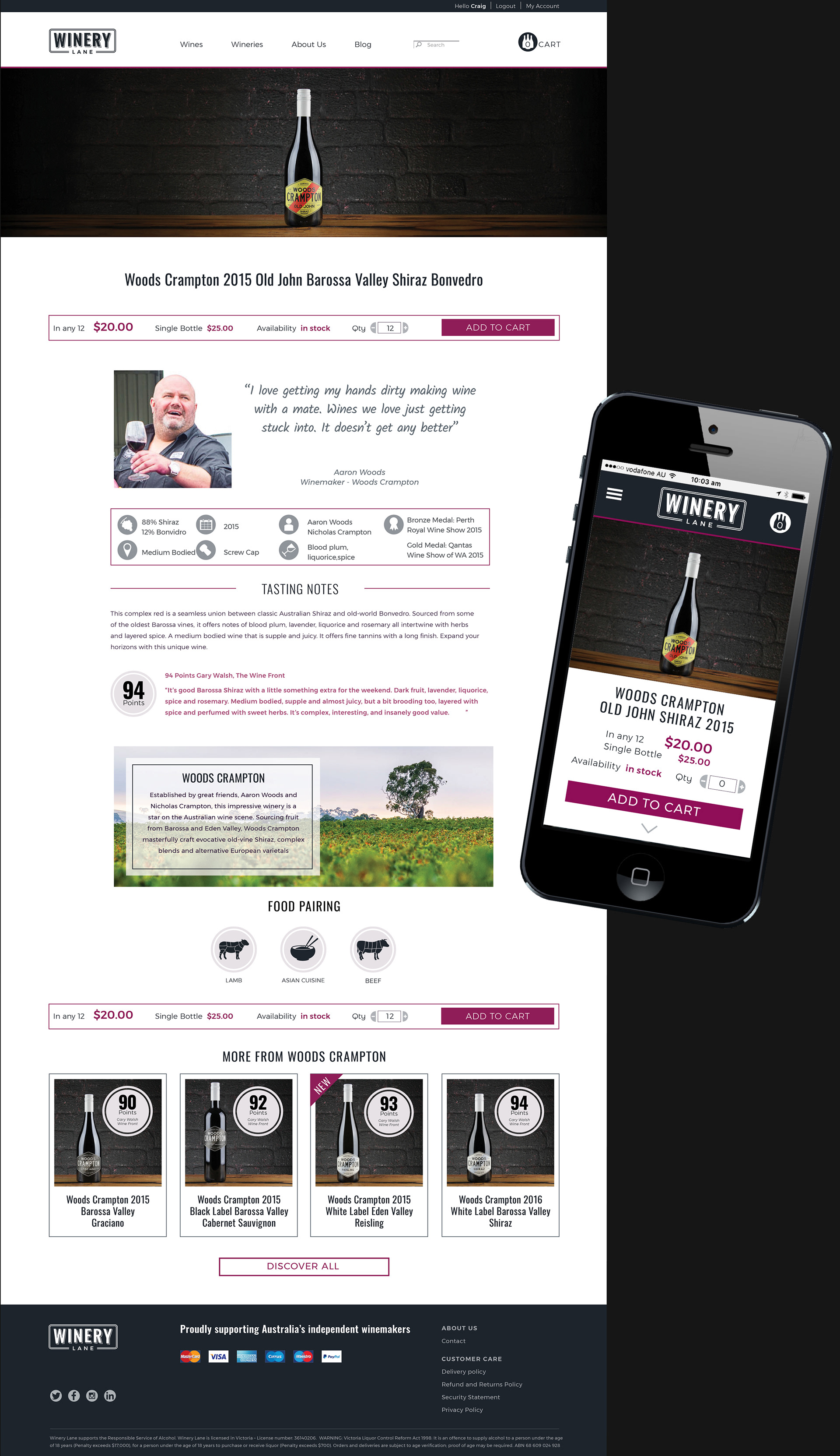
Being true to the brand proposition 'Bringing Wine Lovers and Winemakers Together Like Never Before', I wanted to present the wine product in a clean and simple way whilst still taking the viewer on a journey of discovery in the world of the winemaker. Retail websites that sell off the page tend to be, by their nature, 'noisy'. Using muted and neutral colours with a brighter accent colour, simple, clean typography and a generous use of white space helped to counter this, while also giving an overall feel of quality. Presenting the product in a standardised 'cigarette card' format also made it easier for the viewer to navigate the shop window. Cheers.
To see the full website go to winerylane.com.au